Archangel Michael and the fall of Lucifer: two connected tattoos
Michael above Lucifer: two figures on one arm, joined by the story of a fall. Why I reworked the original reference and gave Lucifer two different wings.
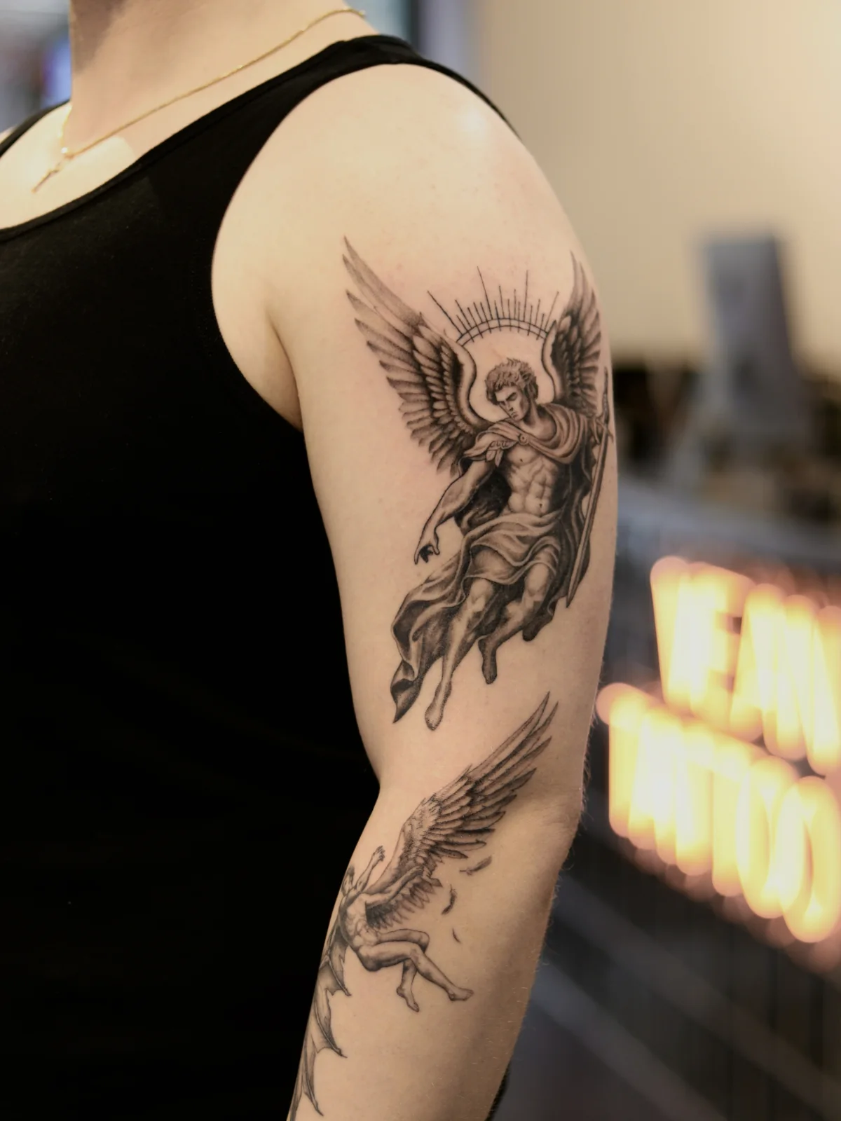
This was my first large original tattoo project. The client wanted Archangel Michael at the moment of his victory over Lucifer. The conflict and the fall mattered to him; the two religious figures needed to tell that story together.
Where the project started
At an in-person consultation, we discussed the meaning and scale of the scene. Michael would represent order and light, with Lucifer below him losing control. We chose a vertical composition and agreed to work in stages.
I developed the two tattoos as parts of one story: Michael on the upper arm and Lucifer below, on the forearm. Their movement and distribution of contrast needed to connect them.
Why I reworked the reference
The client brought an AI-generated picture from Pinterest. It looked impressive on screen, but small details competed with each other and the shading was too even. There was no clear place for the eye to settle.
I reworked the drawing for the arm, simplifying details and separating the main shapes. I wanted the scene to read from a distance. I also considered how lines and shading change on skin over time. That informed the design; it is not a promise that a tattoo will remain unchanged.
Michael as the focal point
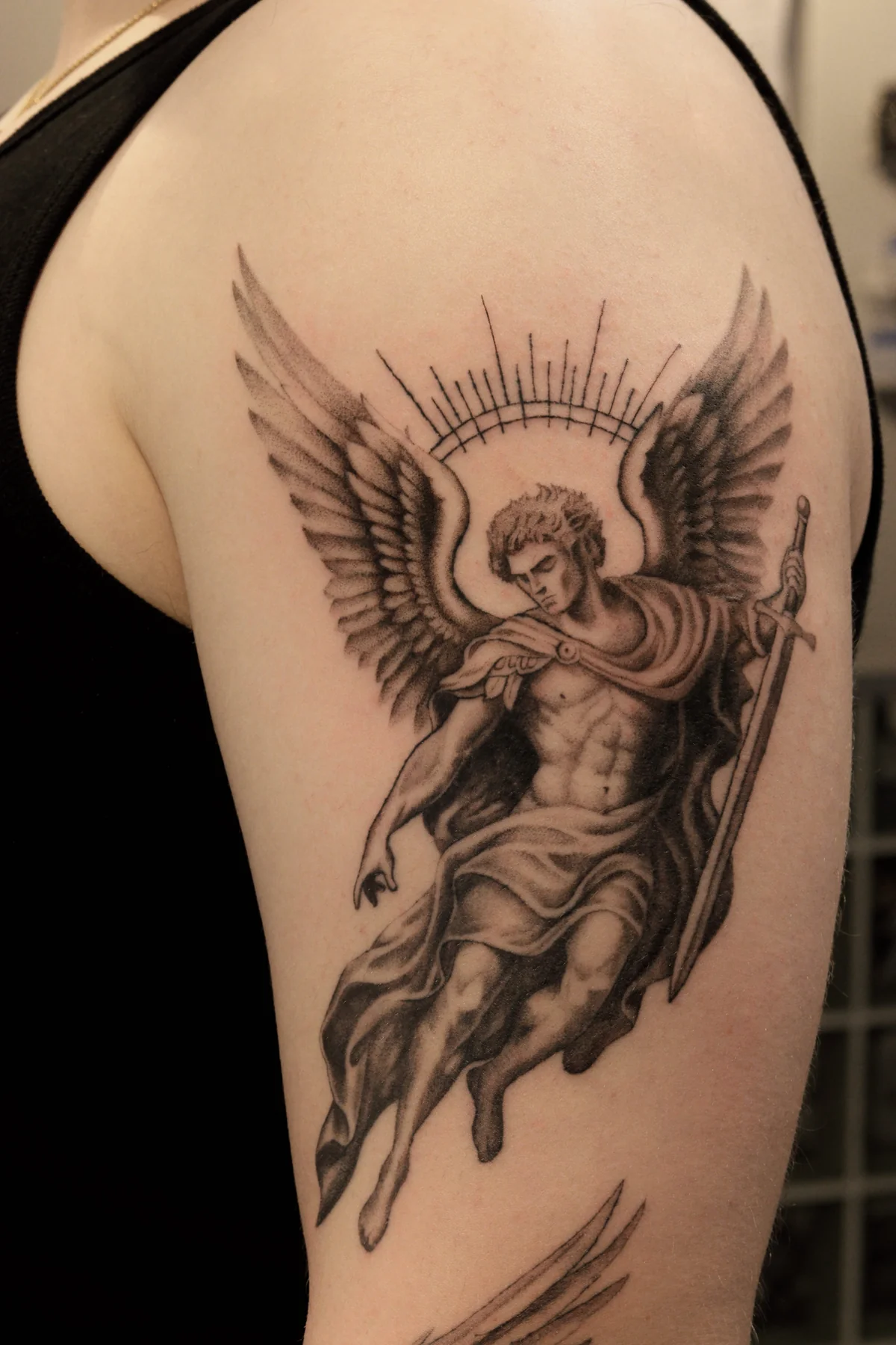
I started with Michael. His silhouette needed to hold attention, so I reserved the strongest contrast for the upper part of the project.
I removed unnecessary folds from the drapery and gave them a clearer direction. I corrected the anatomy by hand. For the wings, the overall shape and rhythm of the feathers mattered more than the number of tiny marks. The sword and halo remained recognisable parts of the figure.
Why Lucifer has different wings
The first version of Lucifer looked too angelic. His beautiful body, feathered wings and heroic pose made him Michael's equal. The sense of a fall was getting lost.
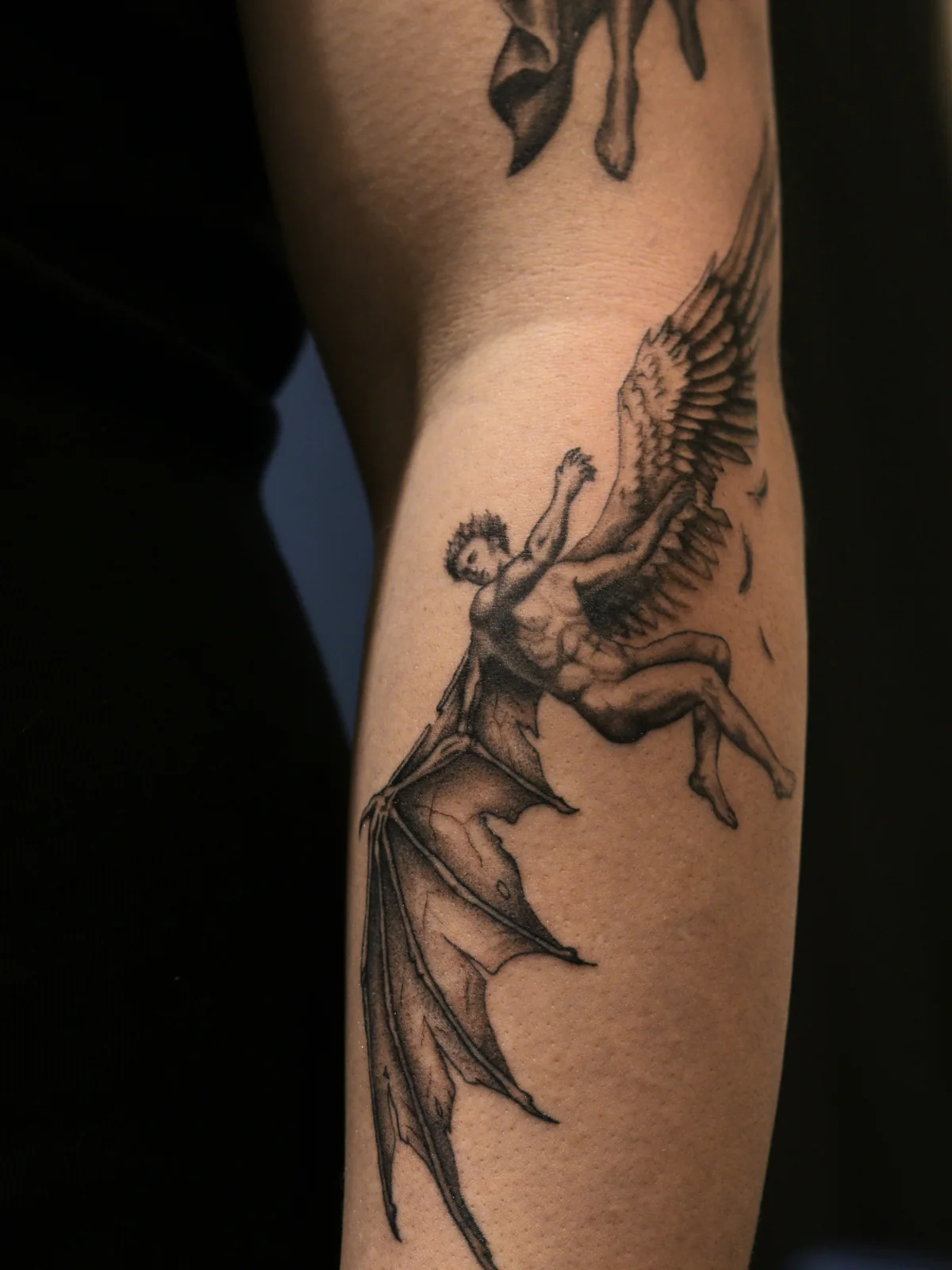
That raised a question: when does he stop being an angel? I chose to show the transformation while it was happening. His body still has angelic features, but his pose already shows a loss of control.
I concentrated the change in his wings. One still has feathers but is losing them. The other takes on a membranous shape. Horns and a grotesque face would have been unnecessary here: the difference between the wings already tells us what is happening.
Fitting the composition to the arm
An arm is not a flat sheet of paper. Part of the design reached towards the elbow, so I had to account for its bend and movement. I checked how the figures related to each other and where dark areas started competing.
Lucifer's membranous wing could easily have become the most noticeable dark shape. I kept its contrast restrained so it belonged to the lower figure while Michael retained the leading role.
Where I used AI
AI helped me try variations of drapery and wing shapes and refine intermediate images. I then selected useful options, corrected anatomy and reworked the drawing by hand into a tattoo composition.
This project shows why that editing matters. The attractive early version of Lucifer contradicted the story we wanted to tell. Changing his appearance solved the problem; adding more detail would not have done so.
Two tattoos, one story
The photographs show both parts together and each figure separately. Michael holds the upper focal point, while Lucifer's falling pose and different wings carry the scene onto the forearm.
This project helped me define my approach: understand what is happening in the scene first, then decide how to show it on the body. Those decisions shaped the drawing.