Leo and Libra: a forearm tattoo dedicated to a daughter
For his first tattoo, a father wanted to bring his zodiac sign and his daughter's together. This is how we developed the design through conversation, until he felt comfortable with every part of it.
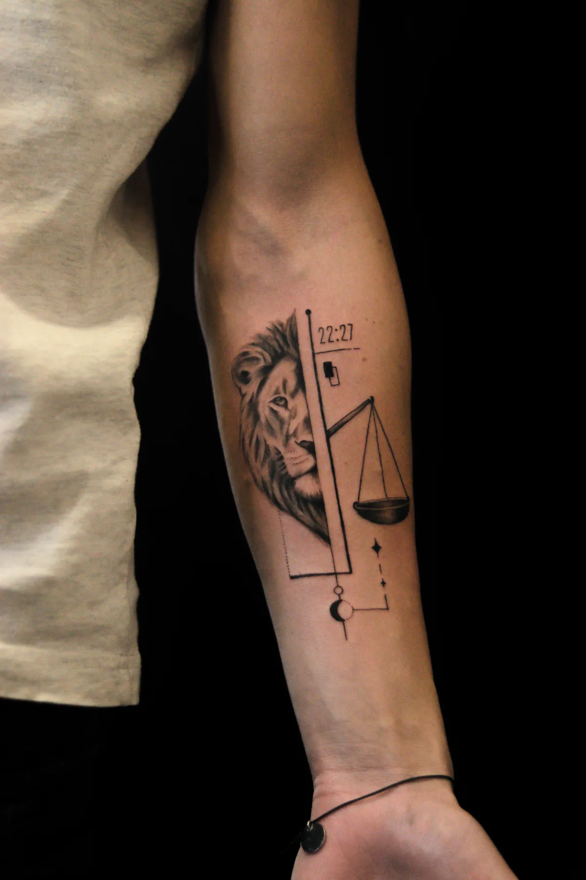
I made this tattoo in Prague for a client who wanted to honour his bond with his daughter. He arrived with a clear set of symbols: his sign, Leo, her sign, Libra, a crescent moon and stars. He had also chosen his forearm. We worked out how to bring the elements together through several rounds of design discussion.
A first tattoo with a family meaning
In his initial message, the client asked for thin lines, geometry and a touch of realism. He wanted the composition to feel light and welcomed advice. I asked for photographs of his forearm from the front and side so I could consider its proportions before we met.
The symbols had specific meanings to him. Leo and Libra connected father and daughter. The moon and stars referred to the words they use with each other: "my moon and stars". I wanted to preserve that personal meaning rather than assign a generic interpretation to each symbol.
Bringing the lion, scales and geometry together
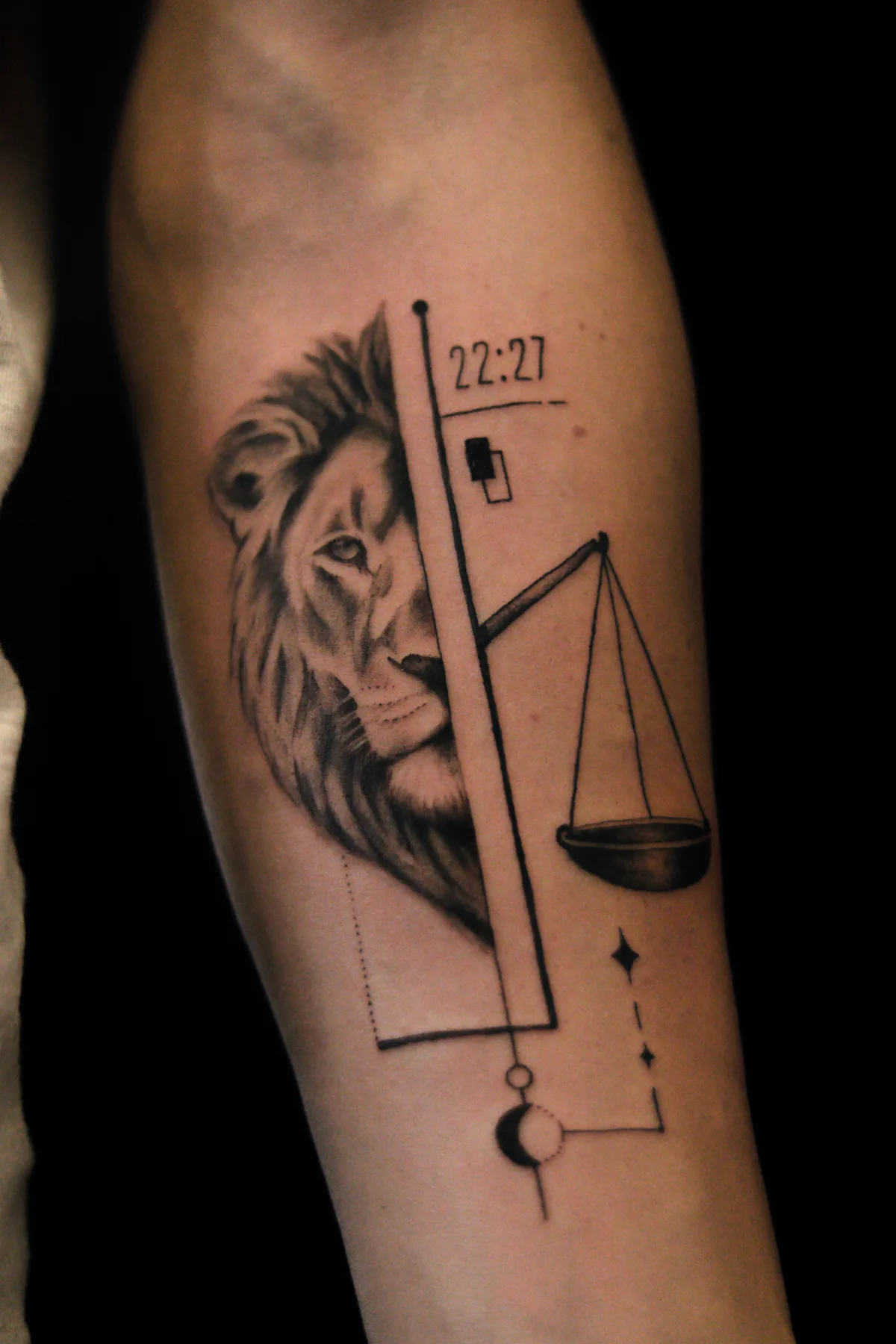
I built the composition around a shared vertical axis. On one side I placed half of the lion's portrait, leaving room for the scales on the other. This brought attention to the lion's gaze without letting the face occupy the full width of the forearm. The tilted beam of the scales added movement.
Stylistically, the tattoo combines microrealism with fine line geometry. Black and grey shading gives the lion volume, while thin lines and simple geometric shapes connect the surrounding elements. Those lines should not compete with the face or scales.
I also showed an approximate preview of the design on a photograph of his arm. I used AI for that placement visualisation and explained that it was only a guide. The actual size and position need to be checked on the arm with a stencil.
What changed during the design process
The first draft gave us something concrete to discuss. The client marked areas he was unsure about on the image and explained what he would like to see differently. That makes feedback useful: we can look at a particular detail and compare alternatives.
His initial brief included the numbers 93 and 22. He later chose to replace them with 22:27, the time his daughter was born. We discussed the size of the digits separately. They needed to be readable without drawing attention away from the lion and scales. We also considered a sentence about the moment an endless love began, but kept only the time in the final composition.
One draft had two crescent moons. He asked me to replace one with stars so the tattoo would match their family phrase. I adjusted the shape and position of these details to make them less prominent than the main motifs.
We removed large decorative gradients at the top and refined the geometric lines. We also discussed giving the lion a blue eye. In the end I suggested working entirely in black and grey, because I felt more confident about that result. The client agreed.
Why the first draft is not the final decision
I do not want someone to accept a design simply because their tattoo artist sent it. If a detail feels wrong or uncertain, I would rather talk about it before the appointment. That matters particularly for a first tattoo, when it can be difficult to picture how a drawing will feel on your own arm.
I also speak clearly when I see a composition problem. During our conversation, the client considered adding another subject that mattered to him. I suggested giving it a separate tattoo so this piece could keep its focus on his family. We discussed it and agreed.
I want to explain my decisions and hear the client's response. In this project he helped shape the details right through to the end. We reached the final design after several revisions, when both the overall composition and the smaller elements felt right to him.
The finished tattoo and the client's review
The photographs show the finished tattoo on the inner forearm. Leo and Libra remain the main motifs, with the birth time, moon and stars adding personal meaning. The geometry connects them in a single vertical composition.
After the session, the client left a Google review. This part means a lot to me:
We gradually refined the design together, made changes and developed it further until everything matched exactly what I had in mind.
Jiří Zelenka · excerpt from Google Maps, translated from Czech
Considering a tattoo in honour of your child?
You can bring a few meaningful symbols without knowing yet how they should look together. For this project, a father's and daughter's zodiac signs were the starting point. The actual design developed through our conversations.
If you are looking for a tattoo artist in Prague for a family forearm tattoo, send me your idea and explain which details matter most. You can include references for the style. We can discuss what belongs in the same piece, the size and what might be better left for another project. Your design will start with your own story.